|

|

-It's not all that often will u guys see me generate a section that seems
to be way too off the original "Computer Tweaking" nature of my website.
But I just recently purchased a new cellphone, the Sony-Ericsson K700i and I just can't help but recommend this darn phone
to other folks out there who are looking for cheap but excellent phone.
-The SE K700i is no longer SE's top of the line phone when it comes to the "K" series, its already
been replaced by the even better K750i which is IMO a bit overpriced for its upgraded features. This phone was released around
early last year. But purchasing it today is by no means a waste of dough if ur looking for a practical phone that can
do most, if not a lot of things at an affordable price.
-To start off, let me inform u guys that I'm not a cellphone guru.
I always purchase mediocre cellphones. I rarely go for the features, I go for the looks. I used to be willing to purchase
a much expensive phone with less features just to be "unique". I hate being typical, but now eventhough around 4
of my co-workers own the same phone, I don't give a @#$% because I really love this phone (and so do they). Another
example, I purchased the Panasonic X70 before w/c is more expensive (at least at the time) but has less features when
compared to SE K300i/500i (w/ the exception of bluetooth support w/c the K300i/500i lacks). I mainly purchased that phone
because of its clamshell form factor and the very small chance of seeing someone else using the same phone (w/c mind u was 0% during the entire time I owned that phone). Now when my sister's phone crashed and she was in bad
need of a replacement, I offered my X70 and for the first time I purchased a new phone for its "features" and not the
looks. Now I'm taking my sister's phone issue as a blessing in disguise. And u guys will know why a little bit later
on.
-Unless u guys just accidentally stumbled on this page, u guys might have already visited a couple
of other detailed reviews on the net. If so, ur in luck. This page is meant to patch up the holes that some other reviews
failed to mention. If u haven't visited them yet, try to read up on the ff links below first to get u started with most
of its features. You can also start by clicking the pic on the left w/c will bring up the official K700i page in
SE's website. My review will feature tips and tricks as well as links to websites that give away free downloads for this
phone (my little way of keeping my website "tweaking" related ahehe!). Again, this is a supplementary review ... hope u like
it!

MobileBurn Review (Highly Recommended)
Geekzone ("Seems to be the ultimate mobile phone")
Mobile-Phones-UK (5/5 Outstanding)
|

|

|

|

|
The Looks / Exterior Functionality:
8.5
Its hard to rate such a category since the looks dept is very subjective
... but hey, its always a part of reviews and is a very important factor with most peeps that wants a phone that does
the job well and look good at the same time right? I have to admit, at first I didn't like the looks of this phone because
I'm a clamshell kind of guy. But after a while, I find this phone to be good looking ... in an elegant and sexy kind
of way.
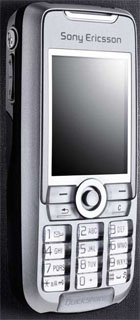
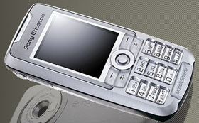
The front portion of the phone host the screen that is usually bigger than other phones of the
same size w/c helps u appreciate pics/videos a bit more. It's covered by a brushed silver metal that looks great especially
when its sitting on top of my office table (I personally like the way light shines on it lol!). The screen has bright
and sharp colors and is still visible under direct sunlight. Directly below the screen u'll find the 9-directional
stick as well as the usual menu and keypad buttons. The screen as well as the buttons use white backlighting w/c perfectly
fits the looks of the phone. The problem with the keys though is that they're a bit too small or too close together. I sometimes
press 2 buttons at the same time by accident. Adding a small gap in between those keys could have easily fixed the problem,
but I guess that's the price to pay for having a big screen on a small phone. At the bottom front portion of the phone we
have the "quickshare" logo w/c represent SE's easy file transfer feature, but at the same serves as the only criticism I can
find in front of the phone because I look at it as a cheap ad banner. On the bright side it display rainbow colors when light
shines on top of it.
On the phone's left side u'll find the camera shortcut button, as well as the multipurpose +
and - keys. On the other side we have the online button w/c is used to ... well ... go online (duh?!). The said buttons
work pretty well especially the + and - keys because they can be used with different tasks. However the camera button
kinda forces u to take pictures as if ur holding a camera (sideways). It's pretty hard to reach the camera button if u want
to access it while the phone is vertically positioned. Yes u can still reach it without having cramps but that also makes
u block the camera lens, unless of course u use ur thumb (w/c blocks the screen) or one of ur left hand fingers (w/c beats
its "easy" access purpose). On the other hand the online button IMO should have added the option to change its function. Although
SE obviously didn't want that to happen because its already labeled "online" ... I just don't see anyone having the need for
an easy online access. I think changing the buttons function to turn the light at the back on/off and use it as a flashlight
is of more use with most folks ahehe! This "online" label/sticker bdway post a problem. The first time I saw a slightly used
K700i, a small part of this label is already off the phone. At first I thought the user just didn't take good care of the
phone, but when I purchased one and noticed that I have the same problem only after a few weeks of use ... I have concluded
that attaching stickers on cellphones is not a good idea (I fixed it with a drop of super glue though).
The top portion of the phone will remind u of some Nokia phones that u used to have because
the power button is located there and is sitting discretely beside the infrared. Right underneath the power button is
a small (red) light that blinks if ur battery is running low. The light IMO is too discretely positioned that some folks might
not even notice that they have such feature on top of their phones. Now IMO positioning the infrared on top of the
phone is a better idea than positioning it on the sides like what some manufacturers do. So all u have to do is to point ur
phone wherever another infrared is located ... no need to move ur phone back and forth to check whether or not ur receiver/emmiter
is positioned properly.
Looking at the back of the phone u'll notice that there's really nothing new or special about
it. Its got the camera, self-portrait mirror, speaker, and light on the upper portion. While the remaining 2/3's serves as
the battery cover w/c slides off if u want to access the battery or sim card. It also host a brushed silver look with
an engraved Sony Ericsson and logo on it. The camera doesn't have any protective lens cover (like most phones) unlike
the K500i and K750i w/c I find weird ... but not a real loss. It is really hard to scratch or put finger marks on the lens
because its not that easy to reach. The self-portrait mirror is nice and has good reflection on it unlike other phones I've
seen or used before. Its not that accurate because if u position ur face exactly on the mirrors sides u will still have
a bit of space on the top/bottom portion and even more on the sides. The speaker should be always placed on the phone's side
IMO. Placing it at the back will only reduce its sound volume especially when u place ur phone on top of a fabric (or anything
that absorbs sound) w/c sometimes causes me to miss a few calls/text ... on the bright side placing it on top of a solid object
like a table helps increase the sound quality a bit (or at least thats what I think it does ... it may have just pumped the
volume up a bit though).

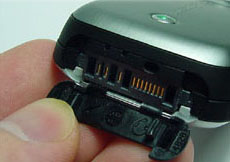
The bottom portion is where the ports are located (as usual). It is nicely covered by a plastic
that is of the same shape as the phone. The bottom portion of this phone is better than most phones with bulging rubber
covers or those that doesn't have one.
On the sad note is that there's no option to change the phone's casing (at least there's no
official support for it). The phone only comes in 2 flavors, the Silver and Blue Tinted Silver (w/c is also not available
in all locations). There are a few places that offers case replacement but AFAIK that will also replace the brushed aluminum
front to a plastic one and some doesn't come with port cover. That ain't good IMO.
|

|

|

|

|
Interface / User-Friendliness: 9
Now this is another subjective matter. But more often than not, peeps will agree that limiting
the number of buttons or stick to push for reaching a certain destination on a mobile phone is a good thing ... right? I believe
SE is fully aware of this and they have taken a huge leap from their previous mistakes. Their phones used to have a bad rep
when it comes to ease of use ... w/c may still be applicable up to now for folks who haven't tried their newer models, but
this phone is really a piece of cake to use w/c is comparable, if not better than Nokia's.
This phone have lots of shortcut's w/c makes it a breeze to use, that is ... if u know they
exist. But first things first ... we'll start off with the main screen. The "Call" (top left) button can be easily accessed
to open up the list of dialled, missed, and answered calls. Then u can either give those numbers a call or send them a text
message etc. The "More" (top right) button serves as the main shortcut button for enabling/disabling silent mode, bluetooth,
and infrared. U can also use it to view the phone status (shows the currect selected profile name, mem available, date, and
mobile number) and set the stick shortcut function. Now u can use the stick to easily open up 4 items. I have set mine
to open up the messaging, profile, file manager, and media player ... w/c is excellent because I can open up a lot of things
with one push. U can also use the stick to move fwd/bck an audio (not applicable for videos), move around the menu's
(stating the obvious here), and zoom in/out while taking pictures/videos.
But wait! There's more! Besides the camera and online button, u can also use the + and - keys
for different functions. On the main menu, u can use it to open up the phone status (again?!). When media player is open,
u can use them to raise or lower the volume ... and if u have the keys locked, u can use it to raise and lower the volume,
but at the same time change tracks by holding down on the key. While taking pics/vids, u can use 'em to raise/lower the brightness.
If the phone is on power save mode, pressing on any of the two keys once will display the clock, pressing on it a second time
will turn the backlighting on. While in standby, holding down on any of those 2 keys will enable u to activate the Voice Command/Dial
function. And oh, of course it does the usual raising and lowering of the earpiece volume.
The keypad on the other hand has a few tricks up their sleeves as well. Holding down on the #
key will enable silent mode (w/c is a common feature), holding down any of the key with letters will automatically open up
the phonebook and position it on the buttons first letter (eg: holding down button 5 will open up ur phonebook entry that
starts with "J" or "K" if u don't have a contact that starts with J). Holding down on the "1" key will automatically
call ur voicemail. And when the backlight goes off, tapping or moving the stick will not activate its specified function but
will just re-activate the backlight. This is a nice feature that will let u re-open the backlight w/o losing ur place on the
screen.
The "C" (clear) button is nothing new but u can use it as a shortcut to delete a highlighted
object on the screen. But the "Back" button can be a bit confusing at first especially if u used to have the top-left button
as the back button. But u'll find it useful when moving around the menus. Why u might ask? Well that will enable u to
use a total of 3 buttons while browsing the interface: the top right button to open additional options, the top left to open/view
the menu/item, and the back button to move back a page ... the combination of those 3 with the addition of the stick makes
getting around the menus faster once u get used to using them.

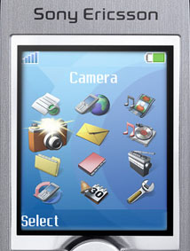
The main menu has a total of 12 icons all displayed at the same time. I find this approach better
than displaying a single icon at a time because it makes the stick more useful ... and although u can easily press the number
for a specific menu option to open it up, having this kind of layout for folks like me who doesn't want to bother memorizing
numbers wanna spurt some tears of joy. The icons however are not animated ... they do however change in appearance and size
once highlighted.
Now most probably one of the major concerns of texter's is the phone's speed when it comes to
creating a message. Older Ericsson models suffer from this but its no longer an issue with this one and on top of that I even
find it a bit easier to text with this phone. First thing I noticed with this phone is that when u type fast, it will no longer
display the other characters that u purposely wanted to skip, it might be SE's way of eliminating the text lag. On the
upper right of the screen the characters are displayed to help text newbies find the right character. And u can use the stick
to move left/right and up/down the page. Holding down "C" will clear ur text word per word. The down side of this is that
u can only access the numerical only entry by holding down on the # key and selecting "123..." as ur writing language ...
I can't find a shortcut key for this one. And if ur used to Nokia's text entries, its best to use "standard abc" as ur writing
language to have access to special characters w/o pulling up the menu to have access to them.
Next >>
|

|

|

